MEFA
Responsive Web Redesign


Some of us are planners. Some of us fly by the seats of our pants. Most of us, at one point, will be faced with the fact that either we haven’t planned enough, or (gasp!) haven’t planned at all, and are suddenly stricken with the overwhelming thought of how to pay for college tuition.
Enter the Massachusetts Educational Financing Authority (MEFA), the premier resource for panic-stricken parents and students facing this very realization, and those looking to get a jump-start on planning. MEFA had a lot of great things going for them: a wealth of expertly-written advice, calendars, guidebooks, courses and calculators to get anyone through this terrifying rite of passage; a satisfied client base; and people chomping at the bit to share the information they’d found on the MEFA site with friends going through the same thing. The issue was organization. How do we calm overwhelmed visitors, and get them quickly and painlessly to the information they needed?
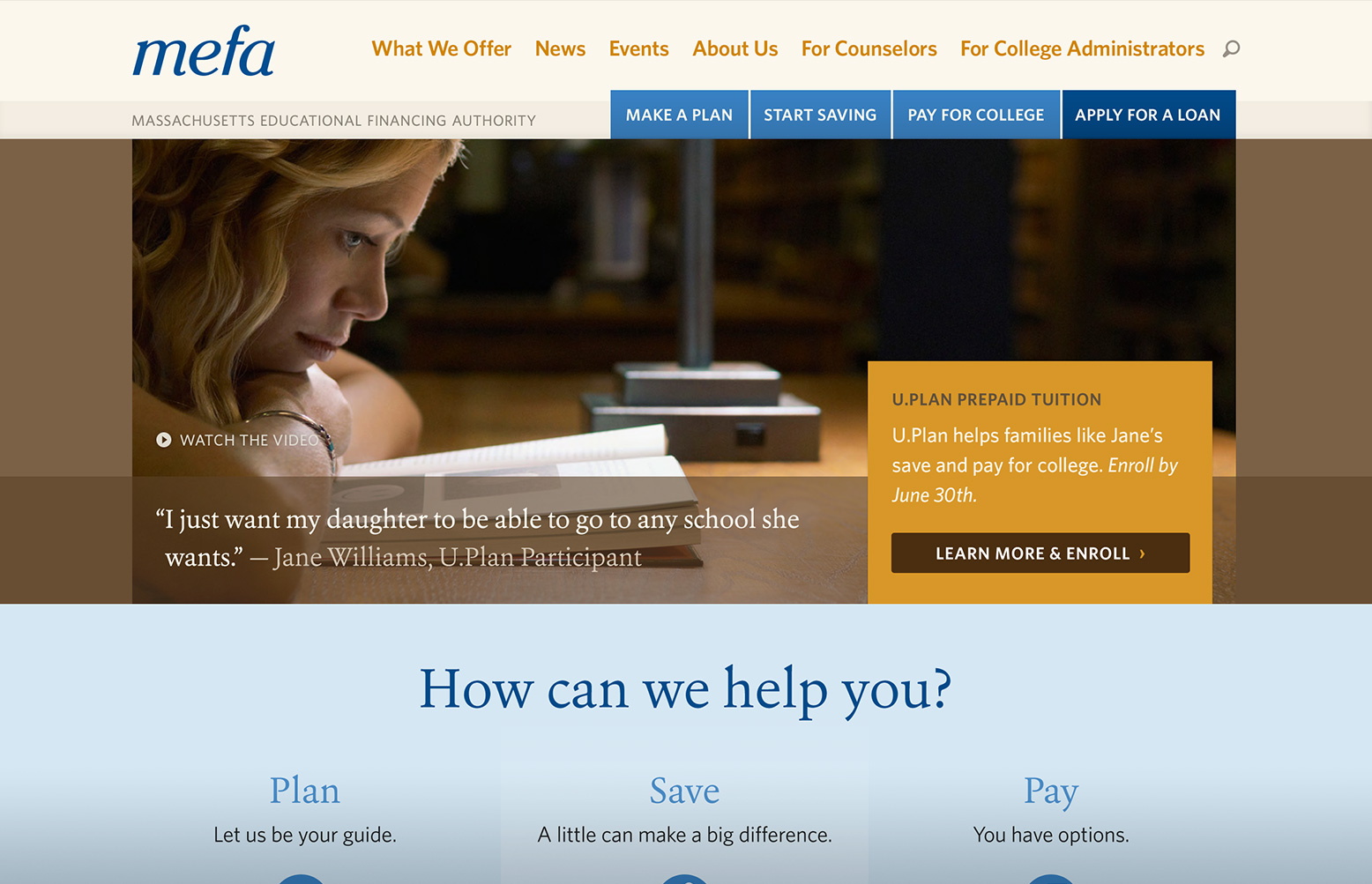
The team at Mule Design Studio had the answer. We combined a very straightforward, easy-to-understand writing style, with an “it’ll be ok” tone; a simple site structure with page content that always led to more information (“Ok. Your 18-year-old is all set, now let’s start planning for your 6-year-old?”); and a warm, relaxing visual style with real life photography, that made the site relatable to parents and students alike. Its responsive design meant parents could start browsing on their laptops at work, and continue to browse on their phones or tablets from the couch later that night. And easy-to-use sharing functionality encouraged visitors to share MEFA resources with their friends.